What ho and all that! If you didn't know, I'm a big fan of Jeeves & Wooster, a series of humorous stories and novels by P.G. Wodehouse. I live for Bertie getting in the soup, Jeeves extracting him from said soup, and for man and gentleman's gentleman soldiering forth to the next misadventure with a tally-ho.
Here's a step-by-step breakdown of an illustration I did recently!
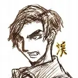
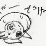
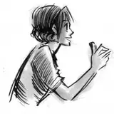
I forgot to save the VERY first pass on this!! Nowadays, I usually start drawing "thumbs" and then draw roughs directly on top, doing a lot of erasing. I love that Jeeves is always gently preening Bertie, and I wanted to draw an interaction with underlying tension. I used a load of reference for this, especially this 8 second stock video of hands adjusting a tie: www.shutterstock.com/video/clip-9175166-close-handsbest-man-helps-groom-tie-his

I've been wanting to push my art a bit more? So this started off as a waist-up picture and then I was like "NAH, draw the full figures." So I moved the sketch to a larger canvas and on a new layer worked on the forms.

I had a really hard time with Jeeves! For a while his head was too small and his waist was too far up? His apron was too short on the first few passes. It's super long and hits almost at mid calf. Bertie I somehow figured out on the first go. I wasn't going for volume here as most of the focus is on the top half of the illustration, basically where Jeeves' hands are touching Bertie's tie
SO...I ALSO DIDN'T SAVE ANY LAYERS DURING THE COLOR PROCESS EITHER....seriously I only have 5 layers for this. The shading and rendering is all on one layer.
When I started coloring this, I tried approaching the lighting source as simple, yellowish, over-the-head daylight....and it felt super flat? And boring? So I pulled out my favorite trick - putting my figures in shadows and back-lighting them. 😩👍 And it shifts the mood! Because this is a scene taking place in the shadows, it feels a bit more intimate. I've also been trying to push my rendering...after years of "cel-shading" Check, Please, I'd like a little more chonk and texture in my illustrations, please??? At first I sought out Leyendecker for reference, as he was the king of chonky brush lines, but I found references for Harry Anderson and Coby Whitmore, two magazine illustrators from the mid 20th century

Coby Whitmore
I kinda like what coby Whitmore does with his colors, he has a pretty closed palette, I feel? The colors sort of flatten out in places, but you still read the form. So feeling inspired by that, I decided to do a lot of detail on Jeeves and Bertie's faces and hands, but I did no rendering on entire patches of their clothing because who cares.

There's been a post floating around Twitter about how to "finish" an illustration, and it's an easy dirty trick and it works. (1) Chromatic Aberration (color fringing) (2) Noise (texturing)If you guys want me to breakdown what those processes are, let me know. But they're easy to google. Basically the first approach mimics the chromatic fragments caused by lenses when they can't focus different colors on the same point. The second is fast way to add texture to color by randomizing differences in saturation/hue, pixel by pixel

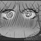
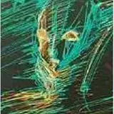
^^Exaggerated chromatic aberration. Feels a little 3D, right?

^^Exaggerated noise. Feels a little papery, right???
5. Done. And the final image: attached in hi-res.

Tinkery-tonk!
Ngozi
2020-01-24 21:38:34 +0000 UTC