Representing the entire Red Alert saga here for the first time! The path of true love has never run smooth for Bruce Banner and Betty Ross... and that path is about to get even rougher! The sinister scheme of M.O.D.O.K. is underway!
A direct continuation of the celebrated 1982 Incredible Hulk cartoon that also draws characters from Spider-Man and His Amazing Friends, Transformers and others into a shared universe.
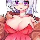
Cover: This was my second and best attempt at producing a cover for Red Alert. The first one was so terrible I don't want to reproduce it here, however I did use the image of the Hulk in the Mk 1 version for the window box in the upper left hand corner. The motif of the hands comes from a panel in Savage She-Hulk issue three-- there are a lot of little homages to comic panels I like throughout Red Alert. It's from a sequence at the start of the issue where Jen is having a nightmare about her recent transformation into She-Hulk. It kind of makes Red She-Hulk look a lot more macabre than she's portrayed in the story, but it's such a cool visual that I don't mind the inaccuracy. One of my favourite ever pieces of work! Everything worked out well-- the anatomical correctness of the hands (very hard to draw) and the colours look fab too.
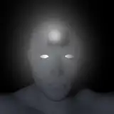
Title Page: To maintain a sense of authenticity, I wanted Red Alert to have a title card as if it were an episode from the 1982 cartoon. What I like about this image is that if you imagine you don't know anything about Red Alert, then this image taken together with the cover makes it look like Hulk is facing a very mysterious and powerful new foe who is quite different from anything he's faced before. Which is obviously the truth! The title cards usually only depicted Hulk getting up to generic Hulk-type shit and didn't tease anything about the story. Since everything that's happening in Red Alert is pretty game-changing for the lives of these characters, it's entirely appropriate that the title page reflects that.
What I don't like is that it's a sucky drawing of the Hulk and a poorly drawn hand. I'm tempted to go back and redo this, to be honest. Also, although the typography is fairly congruent with what was in the cartoon, the title cards tended to look more painterly and distinct from the style of the animation. This is probably one of the first things I'd fix about Red Alert.
Page One: This is where it really began! Except it isn't-- the first thing I drew for the project was the Betty to Red She-Hulk transformation sequence. I was so pleased with that that I wanted to create a little lead in to it. As you might know, I like my sequences to have a good build up. I feel like a transformation sequence is the filling of a sandwich-- and you can't have a sandwich without bread! So, this opening preamble is the bread, I guess. Initially the whole story... wasn't going to be a whole story. I just wanted a bit to explain how and why it is that Betty is hulking out, so I came up with a simple story of Bruce and Betty seeing a UFO and the UFO somehow being a reason for Betty to become red n' ripped. Then I decided to make the occupants of the craft A.I.M. because their goons are fairly simple to draw and they're evil and sciency. Only trouble was, why would A.I.M. want to turn Betty into a hulk? This build up stuff was getting more and more elaborate.
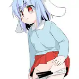
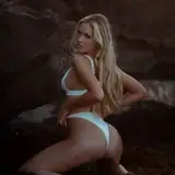
Page Two: I'll just come out with it-- I find something very sexy about the 1982 cartoon version of Betty Ross. There, I said it. It... probably didn't need saying because it's very obvious from just looking at my work, but... there you go. Obviously this is a pretty gratuitous leg shot, of which there are many throughout the comic (and will continue to be!).
Page Three: Those hulk-out sequences from the cartoon are a big, big part of why it is I'm sitting here writing this today. They were thrilling and frightening-- you spent the whole episode in nervous anticipation of them. Fast forward to my teenage years and puberty-me thought "Hey! What if that were happening to a sexy lady?" The rest is history. Anyway! At this point I wanted to do my own take on these iconic Hulk-outs and so here it is. I got pretty involved, freeze framing the cartoon so I could render the trippy backgrounds to look as close to the cartoon as I could make them. The second one I did later on was better, I think.
Page Four: Hulk clap! It's a bit clunky, but I was quite pleased with this at the time. Drawing hands pressed together is tough, and making someone clapping look like they are unleashing an earth-shattering force rather than merely offering applause is even tougher. I could probably draw this a lot better now, but it'll do, I guess.
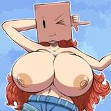
Page Five: This is where the whole thing started to get out of hand-- whilst I was drawing the Hulk-Out I was overwhelmed by the urge to draw a similar sequence for Jen to She-Hulk. That one turned out so well that I just had to include it in the story, which meant that Jen had to be a character in Red Alert too. Because the nature of this project was already a lot more detail driven than my usual work, I researched early 1980s cars to try and make things feel more authentic. The car she is driving is, I think, a Camaro (I drew this a long time ago, memory isn't what it used to be). The colour of it is more in line with comic-book colours, however-- I don't think they came in livid purple. The purple itself is a reference to Jen's hulk side-- purple and green being a standard colour palette for the Hulk.
Page Six:
A few big homages on this page. Jen's pose in the first panel is taken from --I think-- Savage She-Hulk issue seven, where Jen has arrived in the Florida Everglades and is checking everything out before being attacked by Alligators. It's one of my favourite build-ups to a TF scene in that series, and I dug the way Jen was drawn by Mike Vosburg. I wanted this comic to have an emotional connection to the comics depiction of the characters as well as the cartoons. The second 'Easter Egg' is the spaceship. Pretty evidently, it's a gold version of ET's spaceship from the movie. ET left a powerful impression on me as a kid-- I was really, really moved by it. It's probably as important to me as Empire Strikes Back or Raiders of the Lost Ark, but incredibly I've only seen it twice-- once as a four year old and then again a few years ago as a middle-aged man. Some things I just want to keep pure, and not obsessed over by my adult self. I think one of the problems with so-called geek culture is that you're carrying your childhood with you into the present and distorting your own reality of it to fit your grown-up's view of the world. That's why you get these extreme overreactions against new Star Wars films or whatever. Something gets made that you don't enjoy, but because you've invested a significant part of your identity in liking stuff you liked as a kid, I guess some people treat that as some kind of a personal assault. That's fucked up. I should point out that there's nothing wrong with continuing to watch Indiana Jones or whatnot in your forties, but taking a step back and realising that what makes these things special is the time and place they were conceived in and, more importantly, the time and place you first experienced them in is key. You can't ever bring that back for yourself, and the more you try, the further away it gets. And the more you revisit the things you loved as a child, the more their emotional connection to you becomes rooted in the here and the now. I'm finding that with Red Alert-- it isn't really anything like the cartoon it's based on and in many ways it's becoming it's own entity, which wasn't the intention behind it. But that's fine by me, really!
Page Seven:
I think there's a lot of silly humour in the early pages of Red Alert-- the AIM goon watching Seasame Street being an example. I've kind of toned that down in more recent pages, though not by choice. I guess I put that kind of thing in because of the inherent absurdity of what it is I'm doing here.
Page Eight:
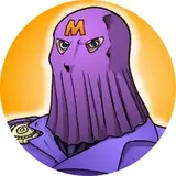
I was really pleased with this page, and even though he's very time consuming to render, I love drawing M.O.D.O.K.! He's such a ridiculous character that I kind of didn't treat him very seriously at first. I don't regret that-- there can be a power in making a villain appear whimsical or ridiculous. I'm thinking of Mr Mxpytalik in Alan Moore's classic Superman story 'Whatever Happened to the Man of Tomorrow', who was a very silly character. Revealing him as an utterly malevolent reality-bending being of frightening power was a stroke of genius. It makes the idea that he's just presenting as a light hearted and mischievous fairy all the more unsettling. M.O.D.O.K., in my presentation of him, is similarly clownish and absurd-- but he's also very, very dangerous, as you'll find out later in the story!
Confidente100
2025-10-05 02:21:04 +0000 UTCChrisxas137
2025-10-03 09:36:16 +0000 UTC