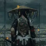

Here is the final artwork for Goblin Ambush! Whoooo! This one was awesome to work on! I had a hard time putting it down and it took every bit of the last 3 weeks to complete. (Even now I find myself wanting to go back and noodle with the odd detail here and there....)
Here is a look at what the original color comp was for the image:

As you can see, I stuck really close to the design of the color comp for the final painting. The key difference ends up being how saturated the colors are. In the final painting you can see that the addition of opaque watercolor in the rendering of the painting really muted the image overall. At first this bothered me, but as I worked on it I decided that I liked the more muted palette. It keeps the focus on the brightly-colored main characters better. They kind of get lost in all the yellow saturation in the color comp.
The image was primarily painted in watercolor, but then I switched into digital at the end to get some of the sharp details and punch up some of the colors in the main figures.

So that is 5 of 6 finished for the first Dungeon Master Print set! (and 5 of 12 down if we go for a full-year calendar set!) I have several ideas for next month that I am currently considering. I am going to get some color comps put together and will then put the next one to a vote. Stay tuned!
Thank you all for your ongoing support! You are making all of this possible.
Justin Gerard
2020-01-16 19:17:31 +0000 UTCSarawarreik
2020-01-16 16:18:41 +0000 UTCJustin Gerard
2020-01-16 14:31:58 +0000 UTCNicolò Rigobello
2020-01-16 14:30:41 +0000 UTC