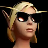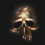
Here are some of the references I relied on the most for this painting:
I used the dude with the dark background for the light direction, and the blonde girl for sort of how I envisioned the value key and the colors.
Separating light and shadow - value + color
If you look at the grayscale, I really tried to keep the light and shadow very low contrast (similar value). What I think really separates the different families is how vastly different their temperature is. Here's a little graphic on how I thought about the colors:
You can take this as a general rule for painting skin if there's a direct light source: the halftone will most often be more saturated and redder than the light.
Of course, this is just the way things usually happen in reality, but you can break this rule any way you like as long as you're respecting and understanding that the light, halftone and shadow all have colors of distinct hues and values.
Hue Variation

As long as you're keeping the values grouped, you can get away with large hue variations inside of that value structure. You must keep in mind, however, that value and hue are not separate and that by changing one you usually change the other as well (mostly colors get lighter as they become more desaturated).
Hope that was helpful! :D
Ognjen Sporin
2021-10-25 06:02:46 +0000 UTCGilles S
2021-10-23 09:28:48 +0000 UTC