not actually but i like to think the poster is convincing enough...
happy friday everyone! i know i'm a bit early for the weekly post but i wanted to post this now because of how much i like it and because it's still fresh in my mind!
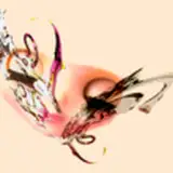
sooo TA-DAH! an 11x17 movie poster parody for jjba part 2!! i've had it in my head for the longest time but i finally started seriously chipping away at it saturday and finished it last night! initially i wasn't going to make a part 2 print, especially since everyone's eyes are on part 6, but i'm happy i went through with it. :")
even though part 2 takes place in the 20s, i wanted to do something more stylish and decided to direct my sights to movie posters from the 60s/70s (to no one's surprise lol). drawing buff jojo guys is NOT my specialty so getting to work with aesthetics i'm more comfortable working with artistically made everything wayy more fun.

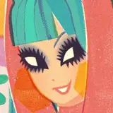
pouring over vintage movie posters is good for the soul and i recommend everyone do it at least once. they'll recharge your creative battery for sure.
eventually i decided that working horizontally would be not only more interesting, but would give me way more room to play around with. i actually ended up making a canvas the same size, flipped it, squished the vertical drawing (shown above) and then used that for my first sketch LMAO

it was really important to me that there was some 'openness' in the pic—that there were generous amounts of negative space. it was something i saw a lot in the movie posters i looked at and wanted to emulate to really sell the look i was going for.
the pieces of bg that were present in the colored versions, with the exception of kars' space, didn't have clean edges, they just kind of bleed into the negative space. i really like the contrast of clean, full colors near the center, and then it kind of losing that as you go out.

working on the colors for this one was interesting. i was adamant about keeping the palette analogous when i first started, and had every intention of going through with it when i started the coloring process, but decided against it last minute. i thought it'd be a bit of a disservice sticking with a strict palette for a jojo piece. especially when the part for that piece has an amazingly colorful opening. ( ´__`).... the palettes are still present, but now there are more!! yay!!
there are a few ways to figure out what palettes i think are best for whatever character i'm working on:
for instance, caesar is blue because because he's associated with that color (anime palette), he has a cooler personality, and it contrasts well with the warm colors already present. despite lisa lisa having a cooler personality + palette, she has a warmer palette to contrast the rest of the pic. she's further back from everyone else but she's bright enough to cut through the whole pic. so there are exceptions, but they still make sense, if you know what i mean. >__<)
everything after the rough colors was pretty straightforward!! i added some texture/grime at the end to emphasize the vintage feel. i wanted to add more but i think it'd probably look weird when i actually get it printed, so i held off...for now.
i might go back and add more text at the bottom + some more minor touches to sell the movie poster look, but as of right now i'm content!!
no .PSD + timelapse because of how big the file is, sorry!! i hope you enjoyed my little write up though!! (* ̄▽ ̄*)ブ
this might count as next weeks post if i don't have anything else to post~
ok bye