Choosing Color Palettes for Your Art: Using Colors from Reference
Added 2020-04-07 03:07:45 +0000 UTCColor is my favorite part of making art, and I often find myself getting a lot of color inspiration from things around me. I have a massive folder of color reference on my computer that I constantly update whenever I come across a piece of art or photography that inspires me, and if I'm not sure what colors I want to use in a piece I tend to go to that folder for ideas.
But once you have a piece with inspiring colors in front of you, how do you proceed? And how do you incorporate the colors naturally into your work? I hope to answer these questions in this guide!
For my examples today, I'm going to be using this picture of a cow laying in a flower field that I came across in this tweet. I really like the atmosphere that the colors in this photo create (and I also just love cute cows).

Picking Colors
The first step, naturally, is to make a palette from the piece you've chosen. But the way you choose to pull colors can effect the final outcome.
Direct picking
The most obvious way to pull colors from reference is to use the eyedropper tool. This is as easy as clicking on areas of the art with the eyedropper tool, then drawing yourself a little swatch set off to the side.

However, this method has a few downsides that are worth considering:
- Although nobody can truly "own" a color palette, some artists consider it bad etiquette to sample directly from another person's work, especially without permission. Whether or not you feel that way is entirely up to you, but it is worth noting.
- Photographs and painterly/textured art pieces are usually made up of many small pixels of varying color combined over a small area to make the illusion of one color, so your chances of actually pulling the color you eyes are seeing are small.
- Though sampling colors directly is the fastest and easiest method, it doesn't do much to train your eye in color theory. You'll learn a lot more about choosing colors on your own and deciding what looks good together through practice.
The Mosaic Method
If using the eyedropper straight away is too direct for you and you'd like a more abstract representation of the colors, then I recommend trying what I call the Mosaic Method.
This can be done in Clip Studio Paint or Photoshop (and I'm sure other programs as well).
With your image layer selected, put a mosaic filter over it (In CSP, this is under Filter > Effect > Mosaic. In Photoshop, it's under Filter > Pixelate > Mosaic ). For more specific color palettes, use smaller squares, and for more broad palettes with fewer colors use bigger squares.

This filter blurs together all local colors within each square, creating a more harmonious color palette to pick from with less random color artifacts.
Eyeballing Colors
The best method of making a palette if you want to learn color theory and hone your skills is to simply eyeball it. Try to pick colors from your color wheel while looking at the reference image, and take notes of any subtle differences between your colors and the originals. Doing this can help you notice patterns in color behavior. A lot of the time, colors we think are easily recognizable in the original can be a little tricky to recreate from scratch, since they only appear a certain way to our eyes thanks to the other colors surrounding them. But being able to isolate the colors yourself from scratch will teach you to overcome that hurdle and use it to your advantage!

This is the method I used for the example piece, since it's the one I've become comfortable using.
Organizing and Adjusting Colors
Once you have your colors picked out, it can help to organize them by value. While doing this, you may realize that the colors you picked out don't have a great range of value. This isn't necessarily a bad thing depending on the type of art you're making, but if you want to base an entire piece around these colors you may end up realizing that they don't work halfway through the piece.
One way to fix this is to adjust your palette with Curves and Levels. This is a quick way to adjust value just by dragging the handles around.

In CSP, these can be accessed under Layer > New Correction Layer .
Another method is to make a black and white Gradient Map (also under New Correction Layer) and set the layer mode to Brightness.
On the contrary, you may feel like your palette is too limited but aren't sure how to add additional colors in.
In CSP, you can make a gradient palette by going to Window > Intermediate Color. Then by filling in the corner squares with your palette colors, it'll make a gradient between them that you can pick from.

From here, I like to take a screenshot of the Intermediate Color window and fiddle with the hue and saturation sliders until the colors are slightly different.

I should note that at this stage, these are just base colors. I very rarely stick 100% to a color palette that I chose and instead use it as a jumping off point for the rest of my colors. By the end it almost never resembles the exact palette I started with, but that's part of the fun!
Applying Colors to Your Piece
With your base colors chosen, you can go ahead and start your piece. Sometimes I have a sketch already done before choosing my colors, and other times the colors inspire the drawing. In this case, the colors inspired the drawing.

As you can see, I went ahead and added some purples to the piece to round it out a bit.
If you struggle to figure out which colors to put where, refer back to your value scale. It may help to color your sketch in black and white first, and then fill those values in with your palette afterwards. (Or, you could turn your palette into a gradient and apply a Gradient Map to your values! This can lead to some happy accidents)
Incorporating Characters and Objects
One problem I used to always face when working with a prechosen color palette was the issue of characters and objects that already had their own color palettes - how could I change their colors to fit the palette while still being recognizably them?
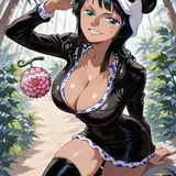
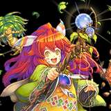
For example, the two characters in this piece are Prince Philippe and Duvont from my fantasy comic Deryli and the Magician's Key. Their default color palettes are very different than the one in this piece.

Without any color adjusting, they don't look like they're really in the scene.
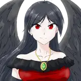
And if I just apply the palette I've already made to them, I end up with a totally different result:

This may fit in with the palette, but the characters don't look very recognizable.
To make your character's natural colors fit in with your palette, try using layer modes to tweak the colors.
I like to start by adding a Darken layer over all the colors using the lightest color in my palette. It may not look like much has changed, but this has essentially changed every color lighter than my lightest palette color into that color. This is a really good base for adding Multiply or Overlay layers on top of.

A good rule of thumb for adding Multiply or Overlay layers to match colors is to figure out what changed between two adjacent colors in your palette, rather than using one of those colors themselves. This is essentially testing your understanding of color theory, which is why it's so crucial to practice when you can.
For example, if you had these two colors in your palette, how could you turn the left color into the right?

It's clear that the purple is darker than the pink, so we know our Multiply layer will have to be something darker than pure white. And since this shade of purple is a cooler color than pink, we know it'll also need to be a cool color itself, like blue.
With a little trial and error, we can figure out that this blue-grey is the Multiply color needed to go from pink to purple:

This same idea can be applied to most Layer Modes. Learning to get comfortable with Layer Modes takes time and practice, so don't feel discouraged if you don't get it right away! If you're more comfortable with the traditional approach of mixing colors like paint, you can always do it that way instead.
After taking a look at my palette and figuring out the color changes between each palette shade, I added a few layers and ended up with these new colors:

I also went ahead and used the same idea for lighting.
Now my characters are starting to get immersed in the scenery and I can go ahead and proceed with the drawing!
Final Notes
While I work on the piece, I try to aim for color variance and ambience as my main objectives. Adding color variance wherever you can is a good way to make a piece look less like a direct adaptation of a color palette and more like its own unique thing. A good rule of thumb is to never be too reliant on the color palette - if you think a change would enhance the piece but worry about it being too far away from your original palette, do it anyways!

By the end of my pieces, they usually don't resemble the inspiration too heavily, and have taken on a life of their own. Here's a comparison between the original cow photo and the final piece!

I hope this guide was helpful! Go forth and make some harmonious artwork 🌈